Domino designs the new digital presence of La Biennale di Venezia
A single site that tells the seven faces of the Biennale and puts the user experience at the center of everything.
THE POINT OF DEPARTURE
The 7 souls of the Biennale lived on disconnected sites among them, not optimized for the mobile experience, each with an important amount of content to manage and an online booking process divided into numerous steps.
OUR SOLUTION
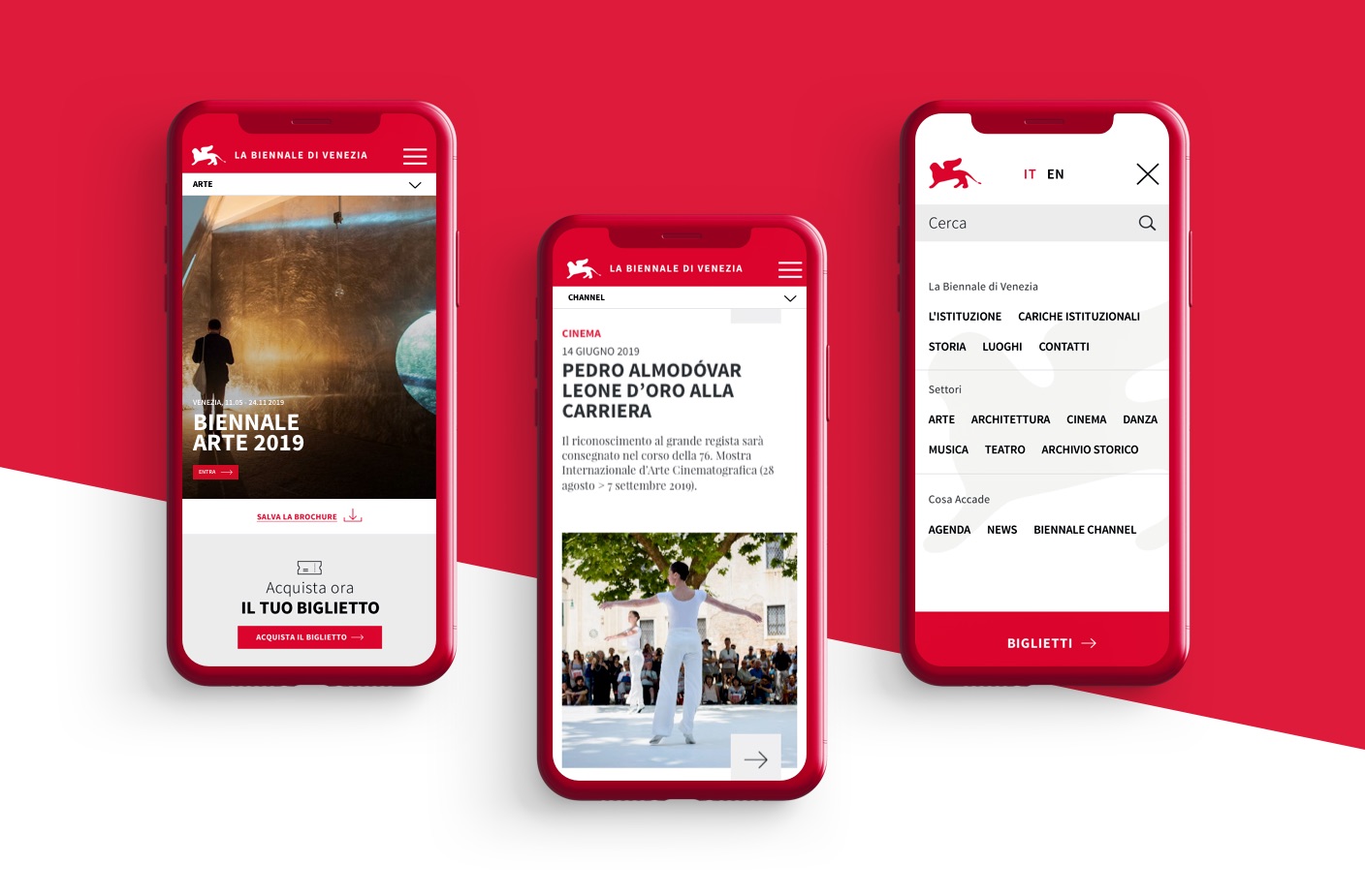
A single site to access all the content, designed from a mobile first point of view to facilitate users on the move, with simple purchasing processes and an better user experience.

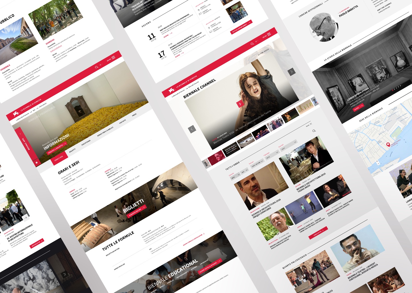
Seven disciplines, one big site.
The new UX / UI helps the user to search for information of interest and to purchase tickets for exhibitions, shows and meetings in a simple and fast way.

Power to users.
LaBiennale.org was built on three pillars, three main objectives to put the user at the center: to offer the possibility to browse and discover content of interest by dedicating a lot of space to images, to create a smart tool to organize one's agenda directly on site and to allow the purchase of tickets in the simplest and most effective way possible.
The site completes and redefines the visitor’s experience by extending the institution's reach across each platform.
Visit labiennale.org
